Comparing mobile web frameworks
I wanted to share my recent experiences with building mobile web ui’s. I experienced working with three different methods of building mobile ui some of them during my day-time job and some on my weekend hacks. I’ll try to give the pros and cons for each method and framework and let you decide which ones fits your project best.
 TL;DR - Mobile Web frameworks are cool, kind of like using Twitter Bootstrap.
I’m gonna go with building without a framework for most stuff.
TL;DR - Mobile Web frameworks are cool, kind of like using Twitter Bootstrap.
I’m gonna go with building without a framework for most stuff.
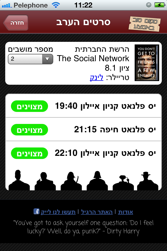
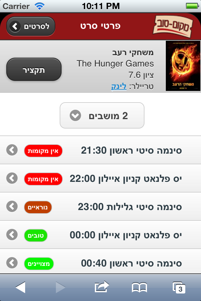
So as I said I got to work with 3 different methods of building a mobile web ui. The first one was building a mobile web ui for my weekend project Makom-tov. I actually wrote and rewrote the ui for that because I wasn’t really happy with the result. I first wrote it in jQtouch and then I rewrote in in jQuery Mobile (Just as it came out of beta). The other project was writing a mobile ui for my project at work eBay Go Together, this UI was designed by our awesome designer and I wrote it using no framework just regular HTML, CSS and Javascript.
Feedback on each method
jQtouch (link)
- It’s kind of old and isn’t updated almost. :(
- It’s a good framework to choose if you need iOS native looking ui out of the box.
- It doesn’t customize that well.
- I didn’t like its methods of describing elements and behaviours. (mostly using classes and conventions)
- It’s methods of dynamically loading pages required to change stuff on the server side
- Supporting RTL wasn’t fun but was ok
- Even if you keep the standard UI it doesn’t look boring because its the native UI
- Poor documentation - need to play around a lot to get stuff to work.
jQuery Mobile (link)
- Amazing Documentation !!!
- Nice standard ways to define and elements and behaviours via data attributes.
- Awesome dynamic page loading.
- Good support for themeing
- Poor support for customizing the UI beyond the themeing
- Did not have a fun time to support RTL
- Default UI is device agnostic which means that it doesn’t look native on any device
- Supports devices I don’t care about at all :(
- Even if you theme it, it looks the same. Creating an ecosystem of boring apps - which makes me a sad panda :(
- Looks like a plugin ecosystem is beginning to emerge

No Framework
- You can do whatever you want !
- Support only the features you need
- You can achieve total customization
- Making it look native take some work
- There are JS and CSS libraries that might do some of the stuff and make it easier
- Need to roll out your own JS to support behaviours that feel native
- Smaller download for user - can minimize the most
- Need to play around with a lot of iOS magic to achieve some stuff (icon, hiding bar and other)
- A good resource for starting something like this is this article that was featured on HN a while back
What should I use?
The first thing to do when approaching development of a web ui is deciding what type of web ui you’re looking for. If you’re looking for a native ui or a customized ui, what’s the scope of your mobile ui, is there a desktop ui as well and other stuff.
Go with a framework if what you need is
- Building fast and well. (think Twitter bootstrap)
- Standard widgets and behaviours (lists, scrolling, swipes)
- Semi-Native looking UI
- Must support many devices
Go no mobile framework if your needs are
- Very custom UI elements
- Few standard widgets in page
- You need O(100%) native ui for one platform
- Like writing your own web/css/js
Some other frameworks for building Mobile UI
There are two other frameworks for building web ui. The first is Sencha Touch - while I didn’t get to work with Sencha myself I heard it is a good and solid framework that has many capabilities that other web frameworks don’t have. The down side of using Sencha is that it’s a completely different paradigm of building web, you are completely dependant on their APIs and design. There also some licensing issue with Sencha products - if it matters to you keep an eye open and check it out.
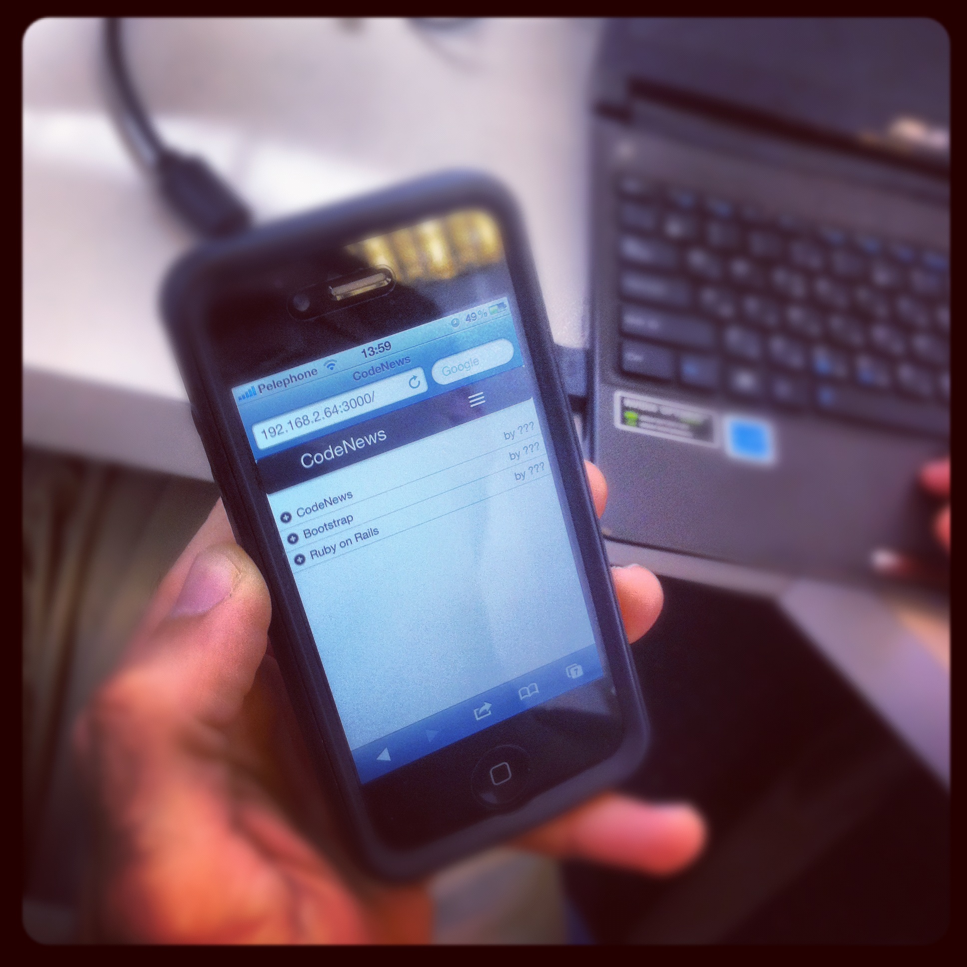
The other framework isn’t a mobile framework per se it’s a web ui framework with good support for responsive design (design that responds to your screen size and adapts). You’ve probably heard about it Twitter Bootstrap. Twitter bootstrap helps you set up an really solid ui very fast and that ui looks pretty good even on mobile devices (the picture at the top of the blog displays such a UI). It’s really good if you want the same overall feel between desktop and mobile. The problem with using Twitter bootstrap is the same as using Jquery Mobile, the ecosystem of ui’s that come out of it all look very similar and boring.
Building Mobile UI in Rails
If your app needs to have both a web ui and a mobile ui you will need a way to control many similar partials and templates There is a very cool way to manage when to display each type of site and also managing your views.
The basis for this method is on changing the mime type for mobile to differ from the regular desktop mime type.
First add your new mime type in the config/initializers/mime_types.rb and then add a before_filter
method that runs in ApplicationController or on whatever controller you need to support.
before_filter :mobile_override

def mobile_override
    user_agent_mobile   = request.user_agent.to_s.include? "mobile"
    mobile_override     = params[:mobile] == "1"
    if ( user_agent_mobile or mobile_override ) and !request.xhr?
        request.format = :mobile
    end
end
Once this filter is in place you need to start creating new templates and layouts to be rendered, each file that needs to have a mobile
version should have a counterpart for the new mimetype.
For example application.html.haml has a mobile counterpart application.mobile.haml
the first one is displayed for desktop users and the second for mobile.
What about partials that are used in both versions? There are three ways to share partials between desktop and mobile. The first one is deprecated and messy and thats setting an explicit format in the rendered file’s name - for example
render :partial => "common/avatar.html", :locals => { :user => @user }
It’s the easiest because you only need to change the calls and not the file names, but this method doesn’t work for when you want the format to trickle down. Lets say our avatar partial uses another partial called photo like so
.avatar
    %span.name= user.name
    != render :partial => "photo", :locals => { :image => user.photo }
In this case if from a mobile template lets say show.mobile.haml I call render :partial with a specific format once that
partial tries to render the photo partial with no format specified it will look for a mobile format and raise an error.
The other way is passing :format => [:html] to the render function - but it didn’t work for me. (this is new in Rails 3.2)
The third way and the one I like best is removing the format from partials that are shared, meaning that in our example common/avatar.html.haml becomes
common/avatar.haml and can be safely called from both formats. You must ofcourse change all the partials even the ones inside but in the end you’ll
have a more organized code base app.html.haml are files that appear only in desktop app.mobile.haml only in mobile
and app.haml are shared across both.
Well thats it - hope you learned something new - and go create a mobile version for your site, users are using their phones more and more to view the web.
You should follow me on twitter @YonBergman and subscribe to my RSS
Comments